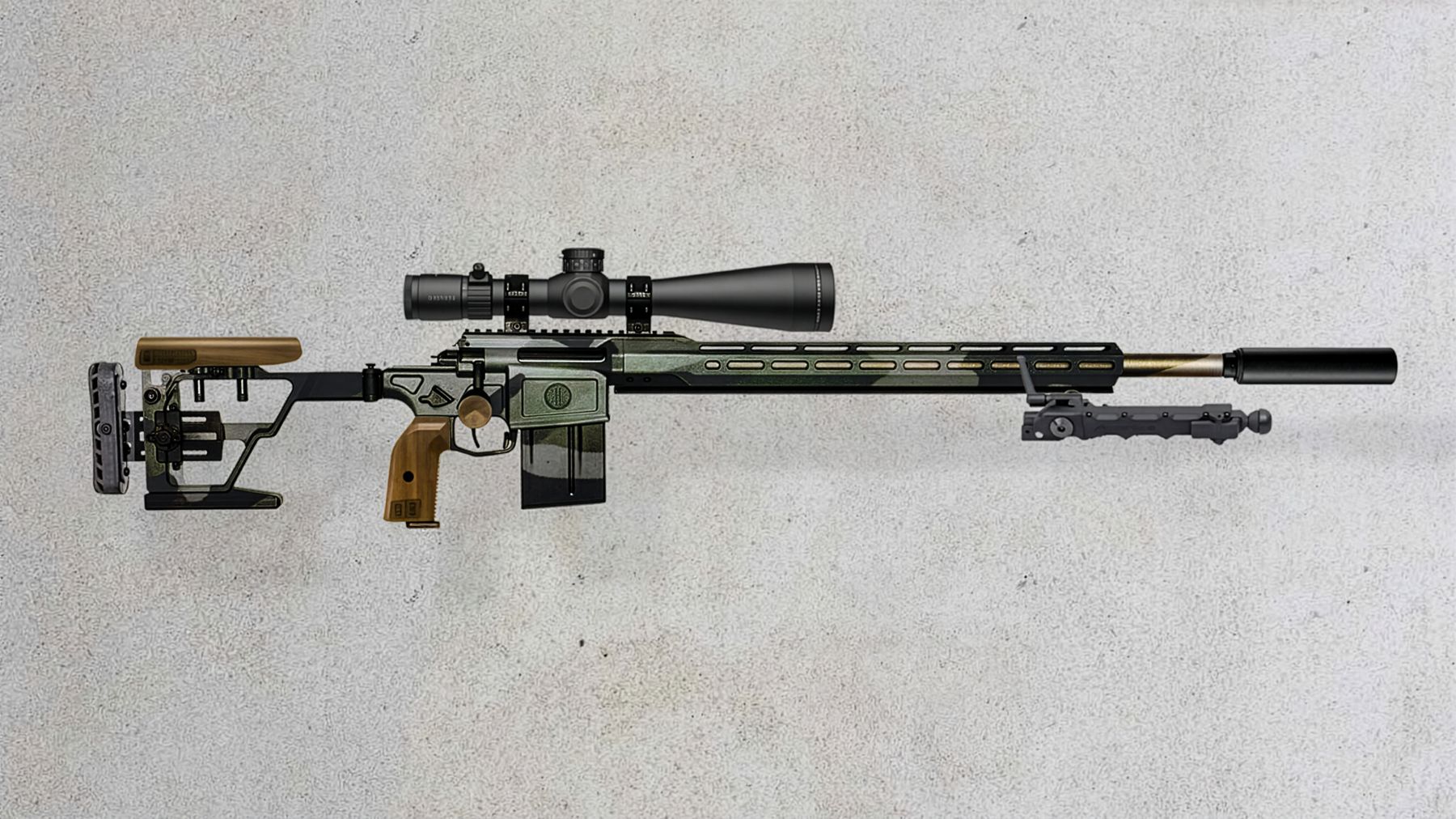

A premium rifle-accessory brand, from naming to launch, that brought craftsmanship into a category built on tactical black polymer.
- What we did
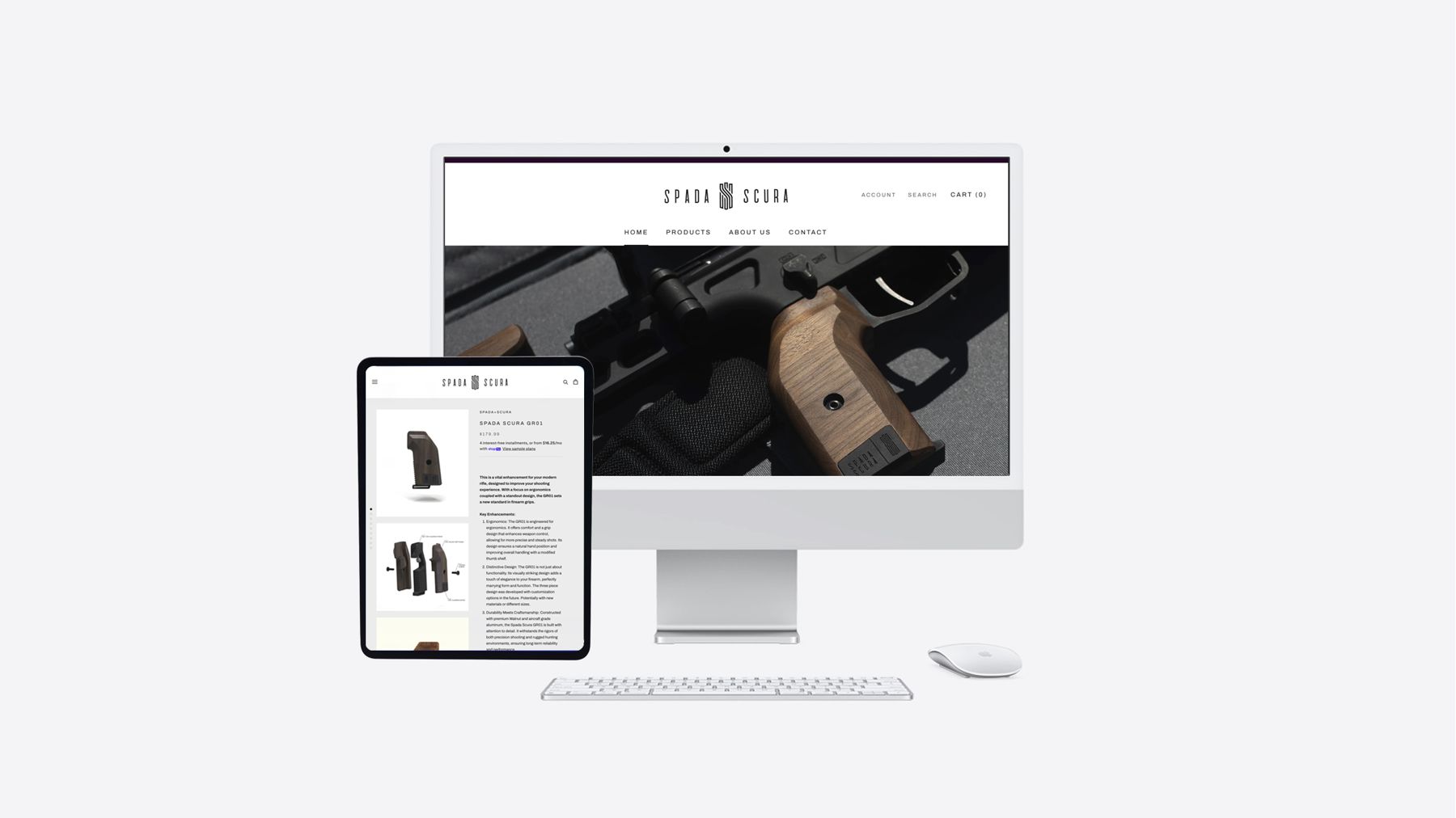
- Naming, Positioning, Identity, Packaging, Website, Product photography
The problem
The category leans on aggressive tactical styling and utility-first messaging. Spada Scura needed credibility with serious shooters while leading with craftsmanship and premium materials.
The idea
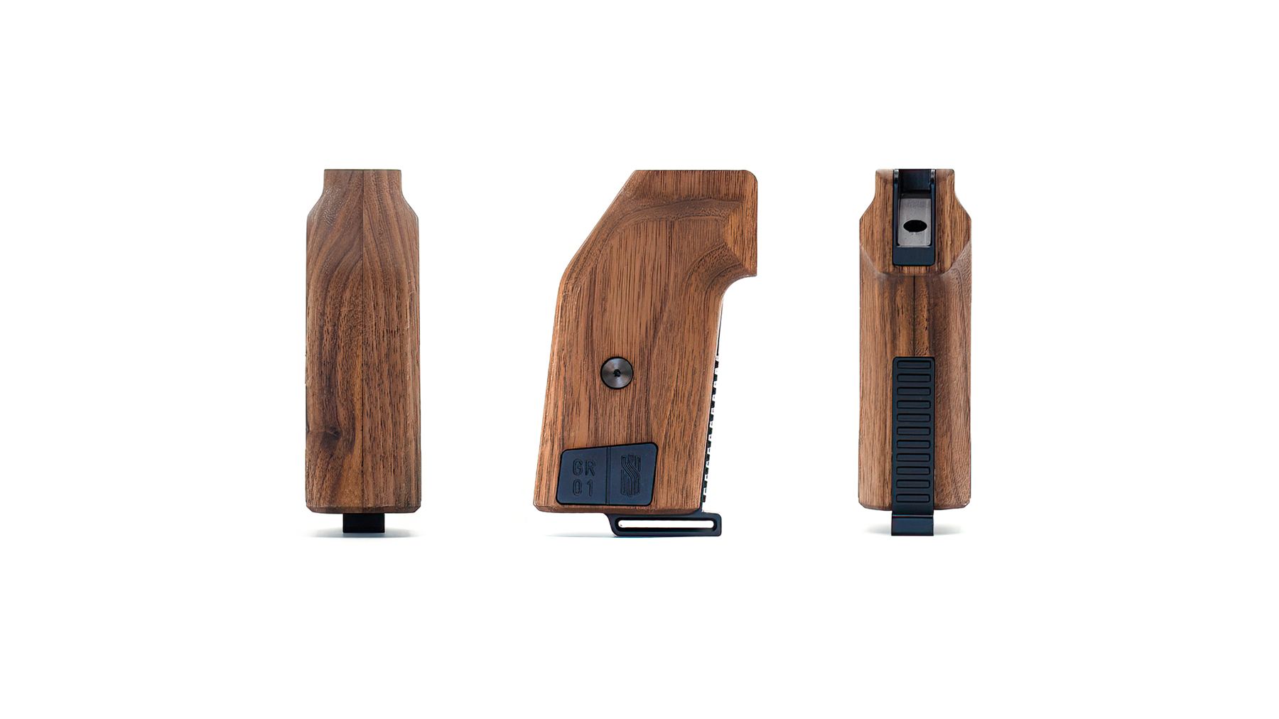
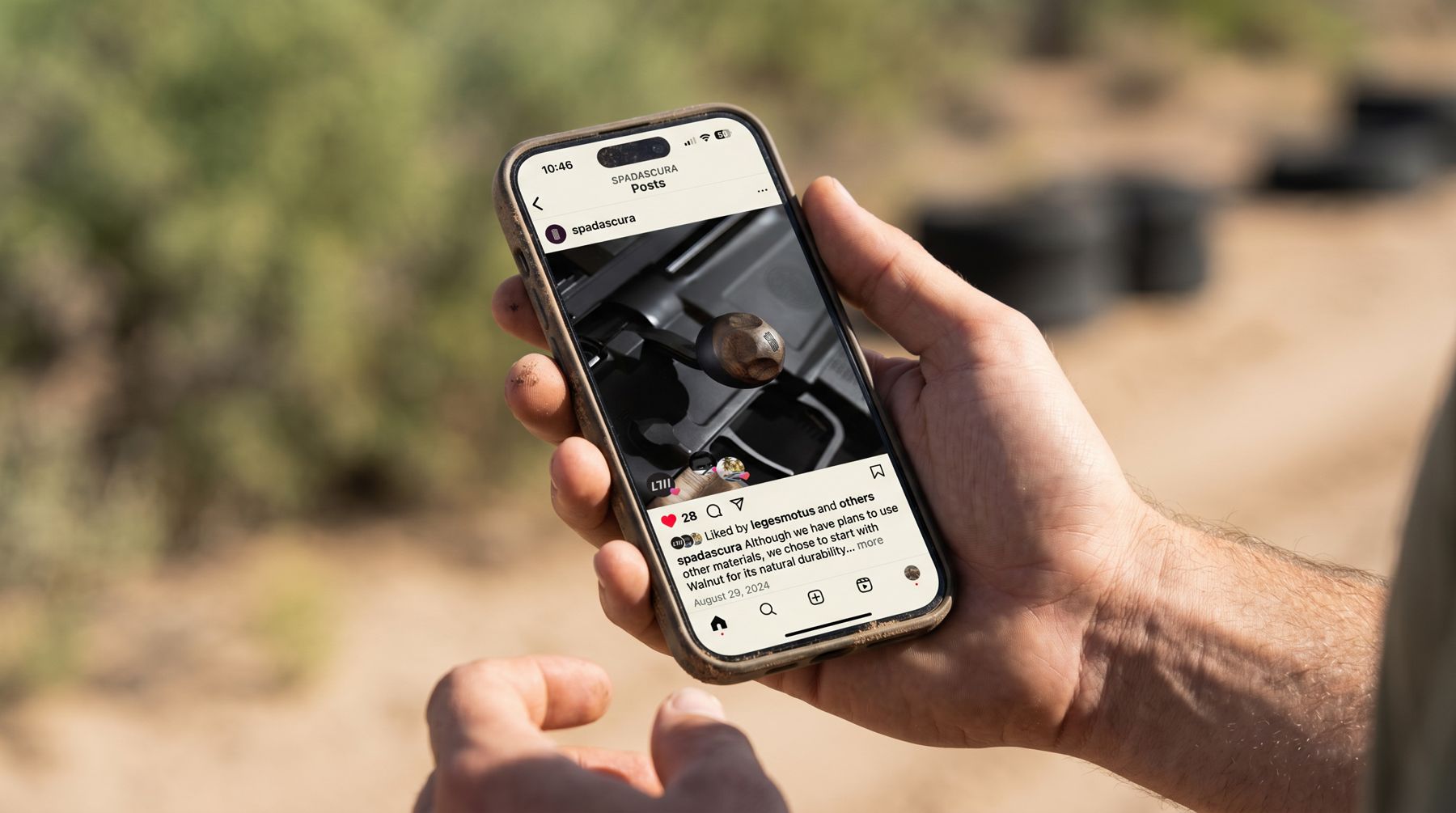
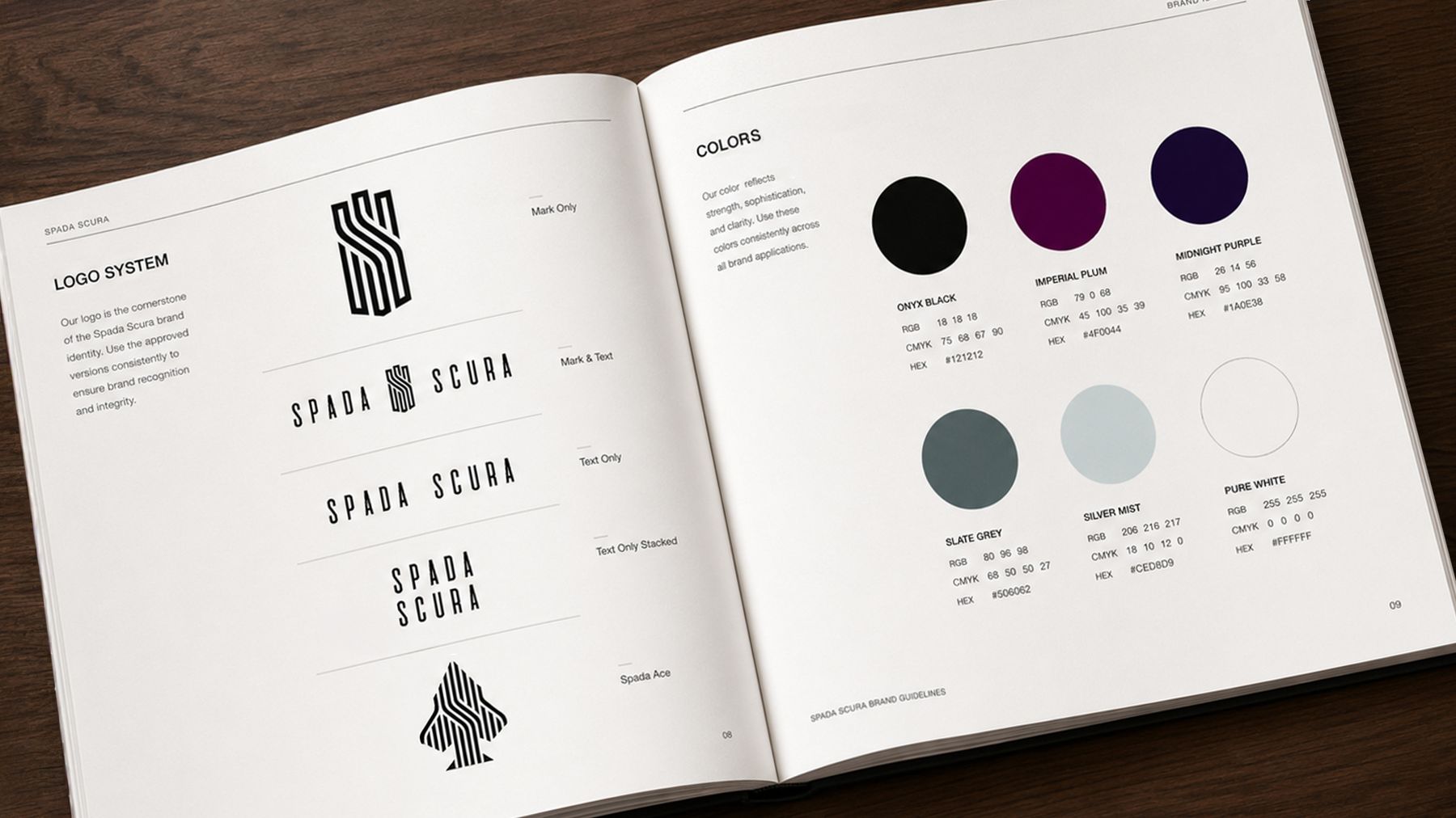
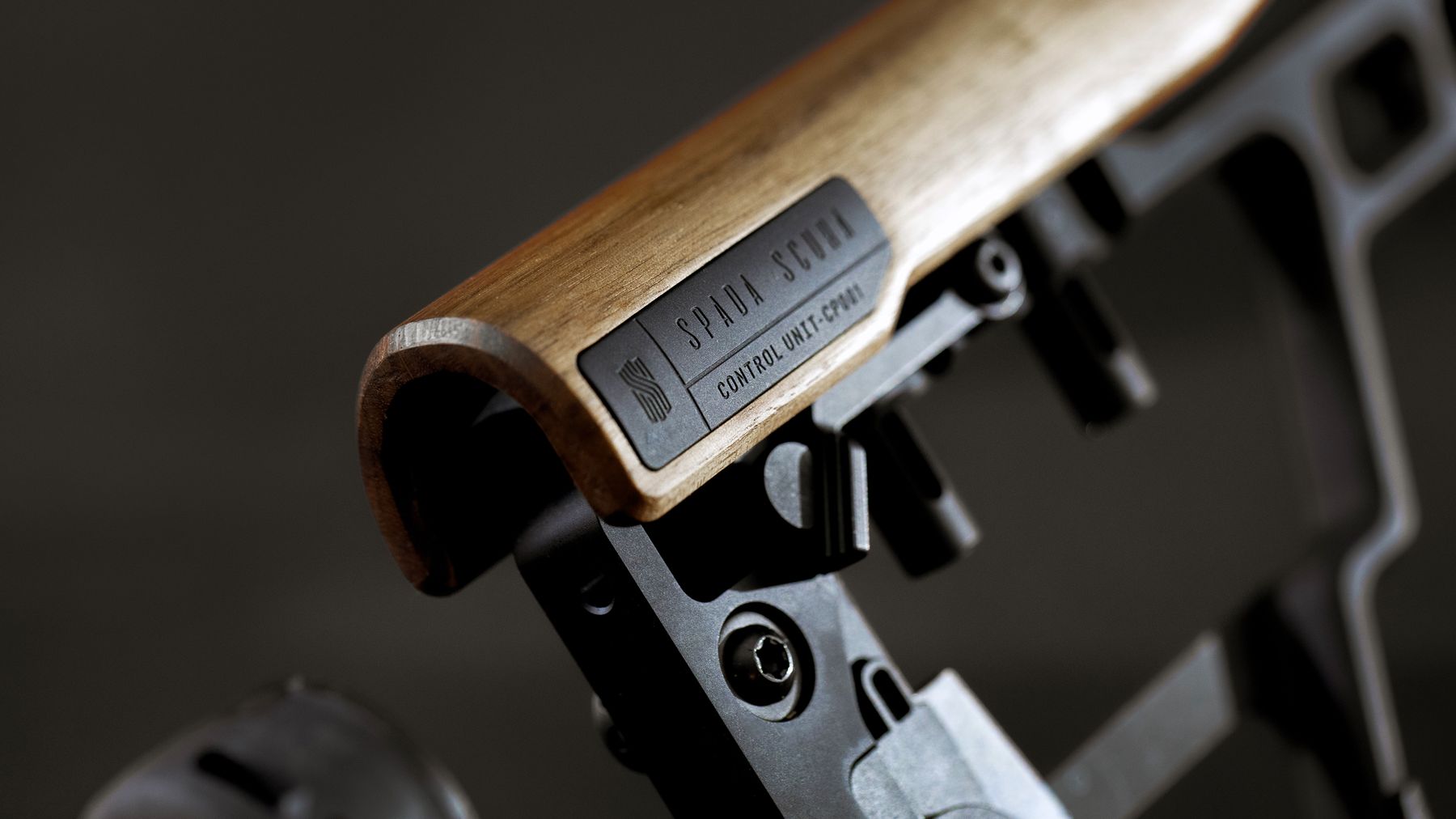
The name means "dark sword" in Italian. The brand is controlled performance over aggression: dark purple, restrained type, walnut and machined metal.
The work
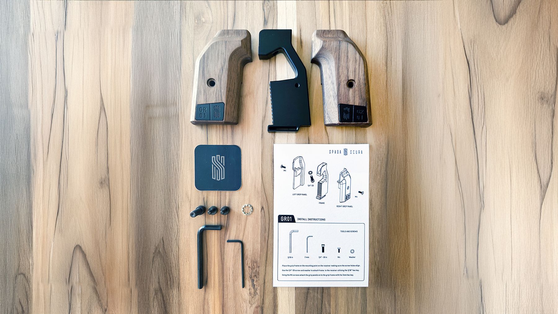
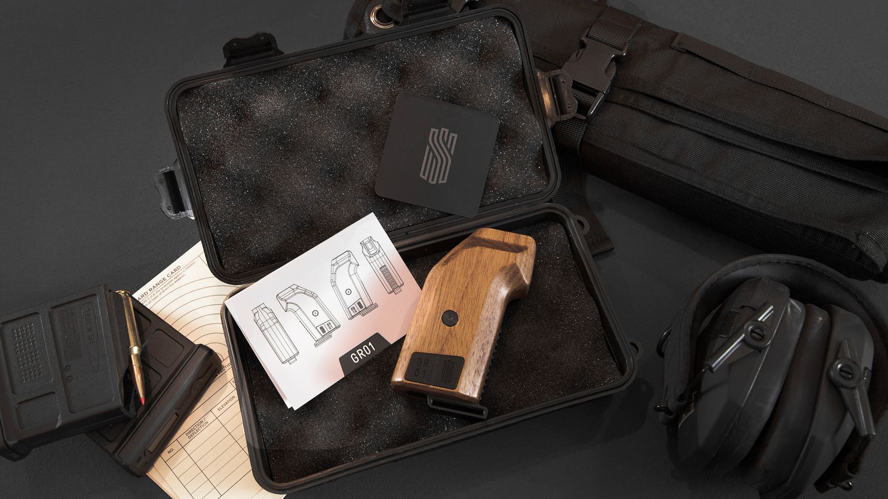
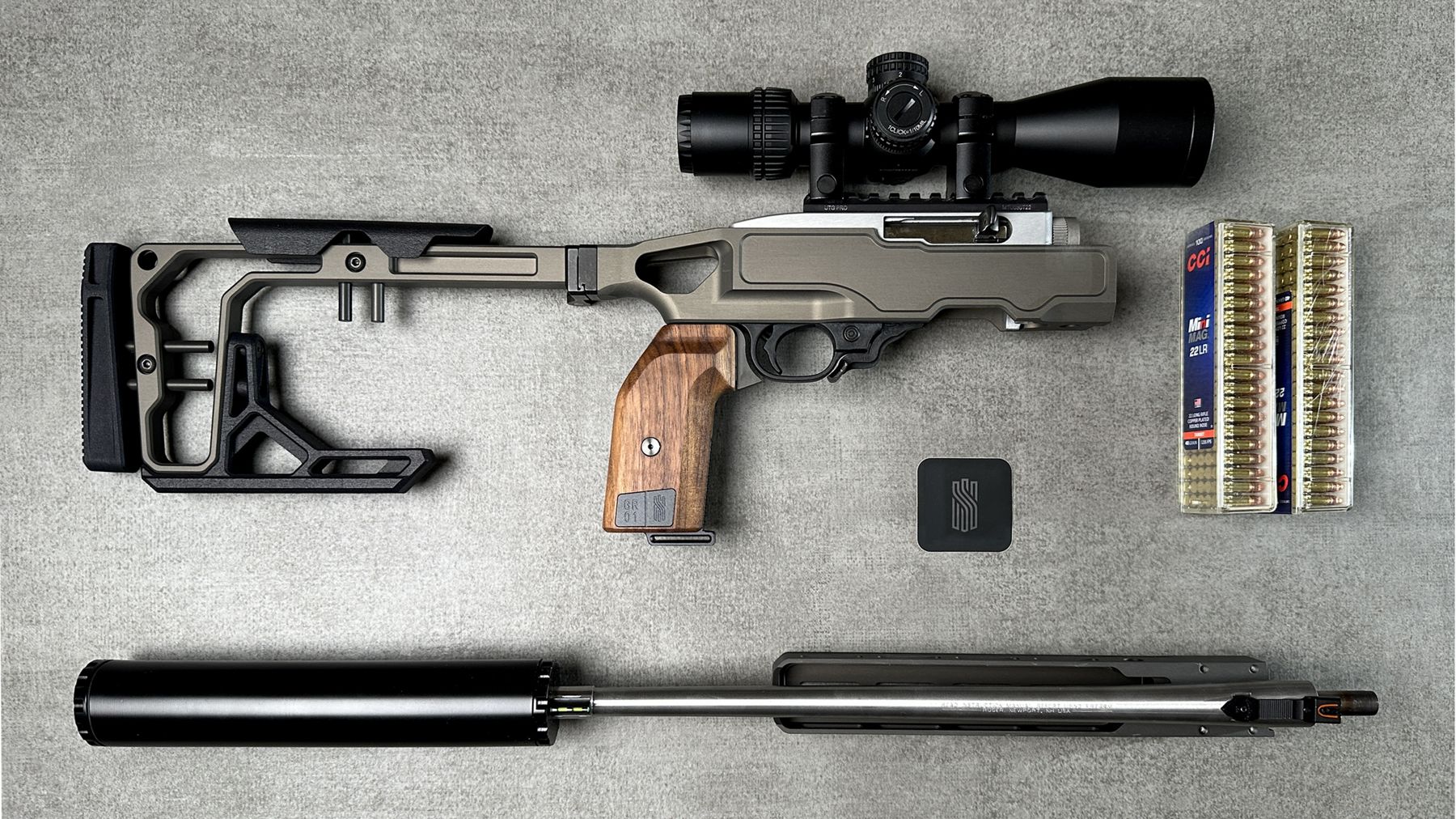
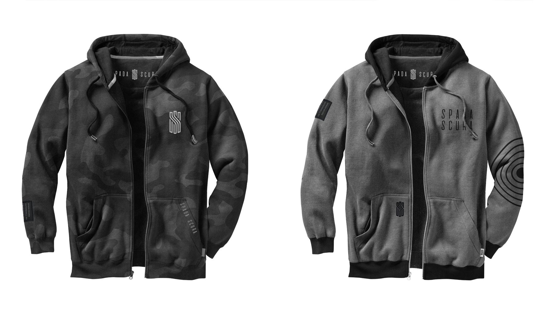
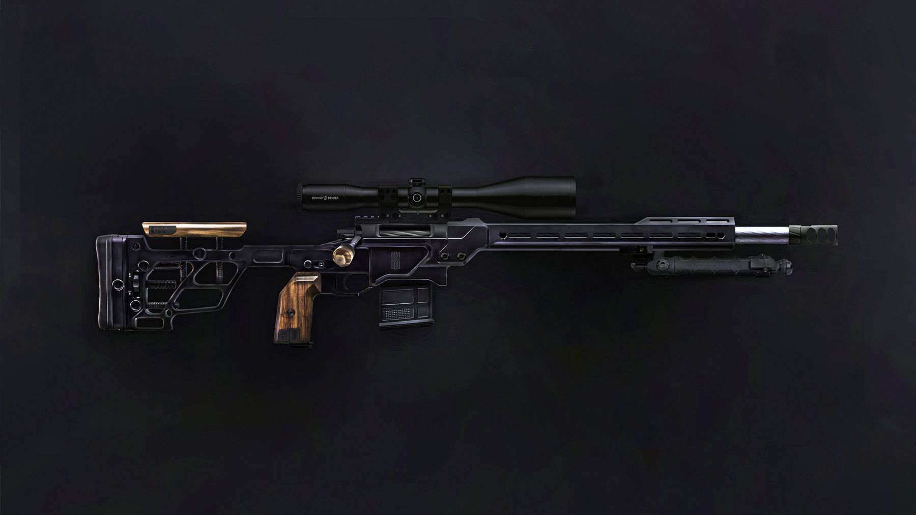
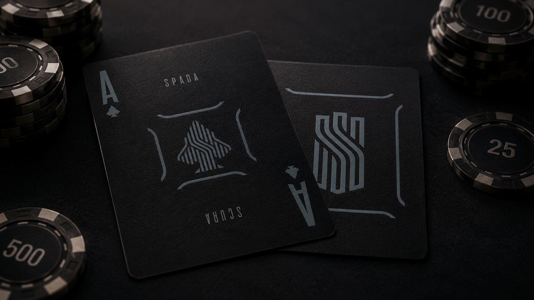
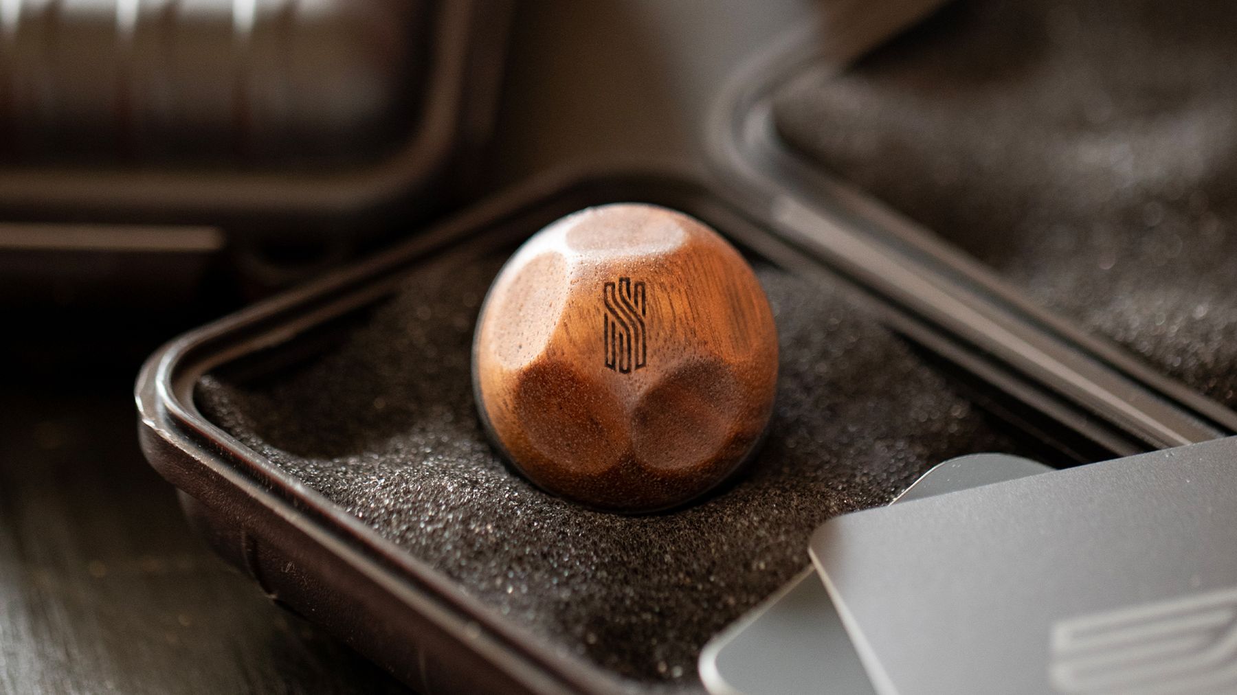
A custom shield with blade details, a hidden SS monogram and three pillars for the three founders. Macro studio photography with compositing to show the products on many rifle platforms without a shoot for each. A reusable case-style package that doubles as brass storage, with a clear install manual. And the Ace of Spada challenge: hit the mark at 100 yards on video and earn a hat you can't buy.
The result
A partnership deal with SIG SAUER and one consistent position across every customer touchpoint.
More from the project